

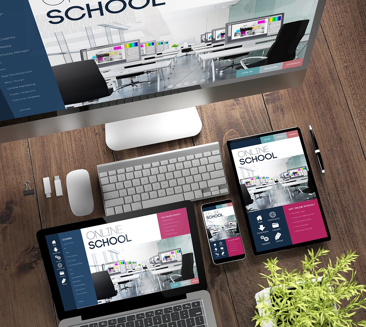
Responsive Web design is the approach that suggests that design and development should respond to the user’s behavior and environment based on screen size, platform and orientation.
The practice consists of a mix of flexible grids and layouts, images and an intelligent use of CSS media queries. As the user switches from their laptop to iPad, the website should automatically switch to accommodate for resolution, image size and scripting abilities.
Request A Proposal
Responsive web design enables your website layout to adapt to even the largest or smallest screens. This adaptive technology is forward-compatible, adjusting even to newer devices and higher resolutions. Mobile users now expect consistent viewing experiences in all devices. Websites should adapt to mobile demands in format and navigation but still look familiar for the user. Menus and submenus should still be in the same locations within the website. This design flexibility and seamless user experience are only achievable through responsive web design.
Request A Proposal
For over 20 years, Antarees Technologies a reliable name in web design, keeping ahead of trends and technology advancements in the industry. And as responsive web design became vital in the success of websites, Antarees Technologies stepped up to produce quality designs that are not only adaptive but also highly optimized.
We aim continually learn the best practices, keep up with emerging design concepts, and further hone our team’s expertise in the field. As a result, we consistently produce innovative responsive web and mobile-only website designs that provide seamless user experience across different device sizes.
Request A Proposal

Antarees Technologies
Industrial Area HMT
Srinagar, India

+91-700-6966-592
24x7Get Subscribed!